Green Magic Landscaping
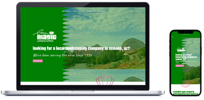
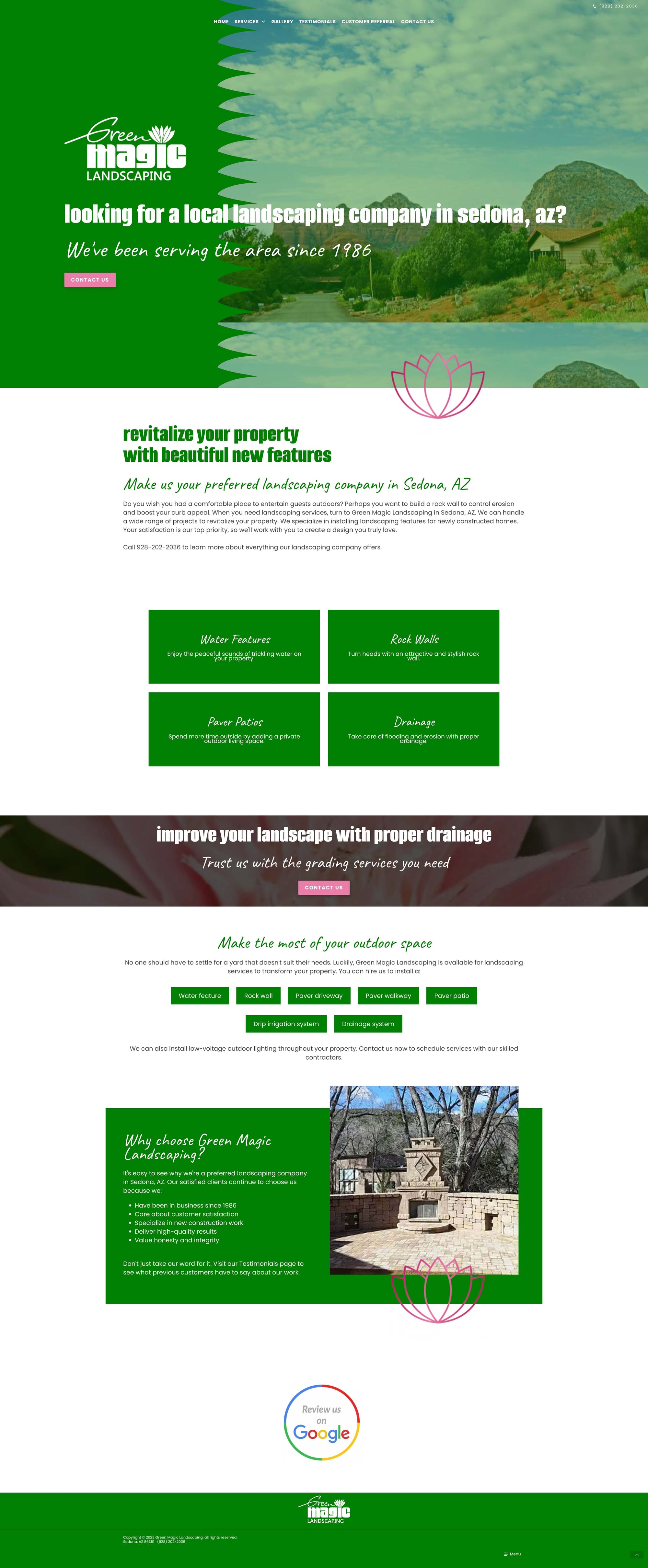
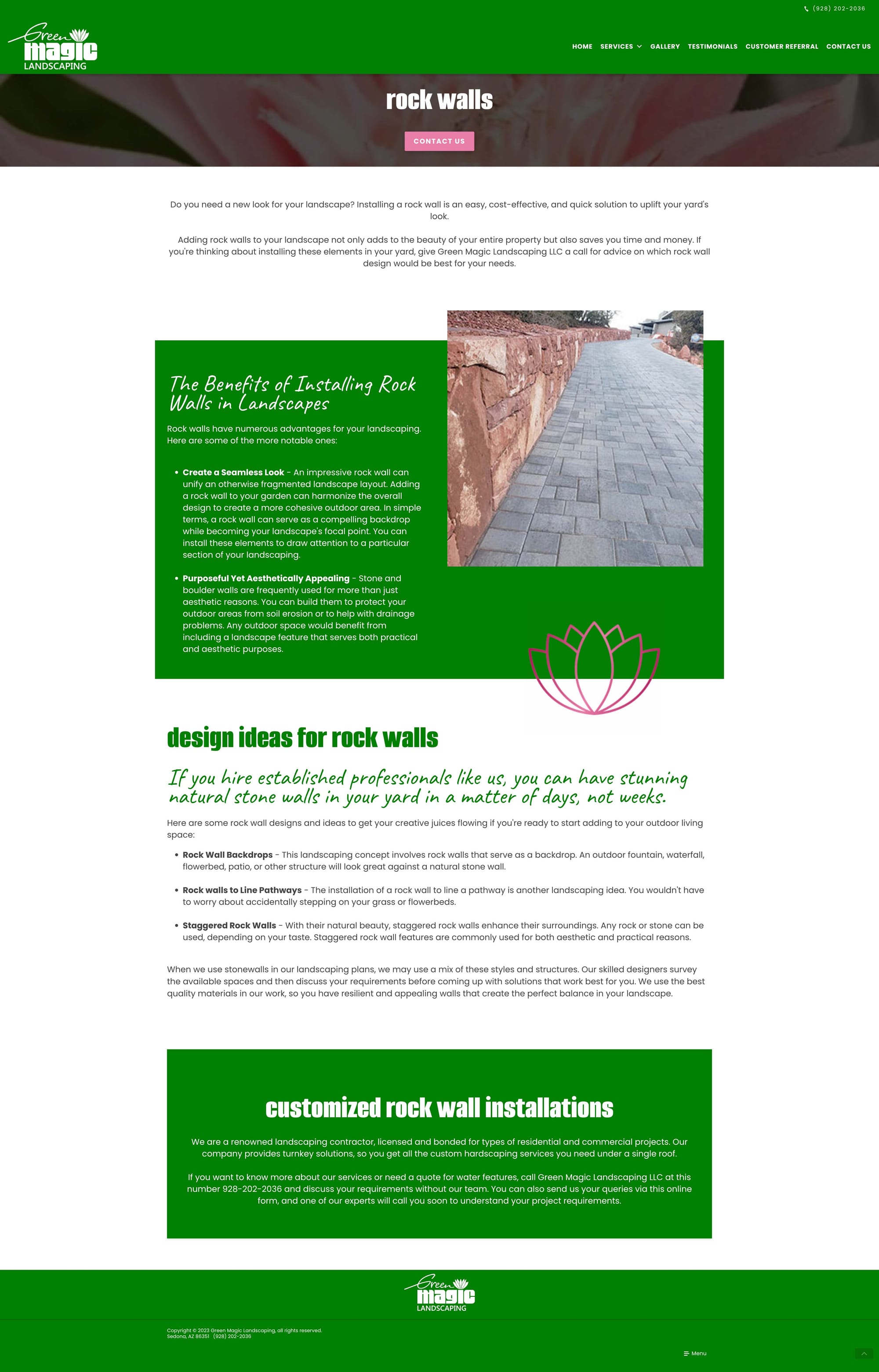
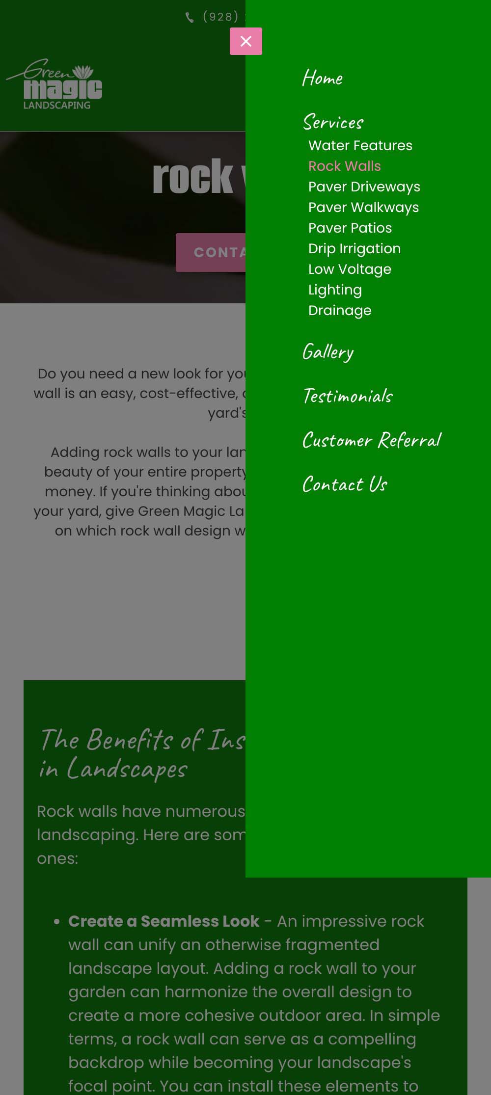
Green Magic Landscaping said they had a "very blocky" site that needed to be updated, and provided a logo with some funky fonts and a bright color scheme. I had to take this opportunity to add fun elements from their logo throughout the site as well! The hero image was also a great learning experience on how to implement code from external sources onto a very limiting platform. Their site went from "blocky" and outdated to fresh and modern, just like a property brought back to life by their landscaping!
Scroll below and click on an image to view the full design.
CSS coding and website design *Do not own rights to pictures or logo*
Be sure to check out other web design projects I've worked on too!
Scroll below and click on an image to view the full design.
CSS coding and website design *Do not own rights to pictures or logo*
Be sure to check out other web design projects I've worked on too!


